Byker Wall is the foundation for co-creation
AI transparency: Human written, AI Assisted
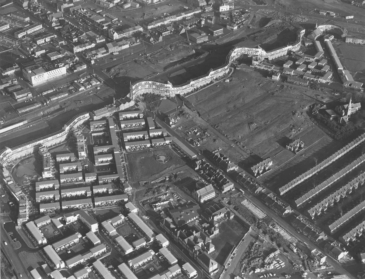
I saw a post this week on Instagram from a local architect. They had accompanied a university group on a site visit. The students bemoaned “this place is awful”, “why is more not being done here??”.
The architect reflected on how easy it is to have a saviour complex: “I don’t like the place, therefore it is a bad place”, “I wouldn’t want to live here, therefore it needs fixing”. It is the power imbalance of swooping in on a site visit, spotting a problem and designing a solution. It assumes everywhere needs fixing and everywhere needs saving. Analyse, diagnose, improve. All without empathy, without knowing the people, without listening.
What really sparked my interest was that the picture with the post was of Newcastle’s Byker Wall estate. The post didn’t explicitly say Byker was the venue of the visit, but it reminded me of the amazing history of Byker Wall and its empathy and user-led design.
1970s co-creation
Designed by Ralph Erskine, Byker Wall is an unbroken, mile-and-a-half-long block of 620 maisonettes built to shield the inner estate from traffic noise and North Sea winds. It’s also famous for the TV show Byker Grove that gave us Ant and Dec (but that’s a different story).
The Wall doesn’t meet 2026 design standards (it’s “Functionalist Romantic” according to Wikipedia?). But it was a triumph in designing with residents and with empathy. We’d probably call it co-creation today, but for a 1970s estate it was unheard-of collaboration.
Flexible from the get go
In the face of a local Tory council that wanted to disperse and displace residents, Ralph Erskine and co landed in Byker with a very different approach. Instead of a traditional ‘master plan’, they created a ‘Plan of Intent’. This plan included explicit social goals, preservation of traditional values, keeping family ties and strengthening community. “Byker for Byker people.”
Start with research, not assumptions
In addition to an independent survey of residents, the architect firm ran a pilot with 46 families.
The families’ preference for bright colours to signal a new Byker can still be seen when walking through the estate today. The pilot group also pointed out landmarks and features of “Old Byker” that should carry into “New Byker”: certain pubs, corner shops and the Shipley Street Baths.
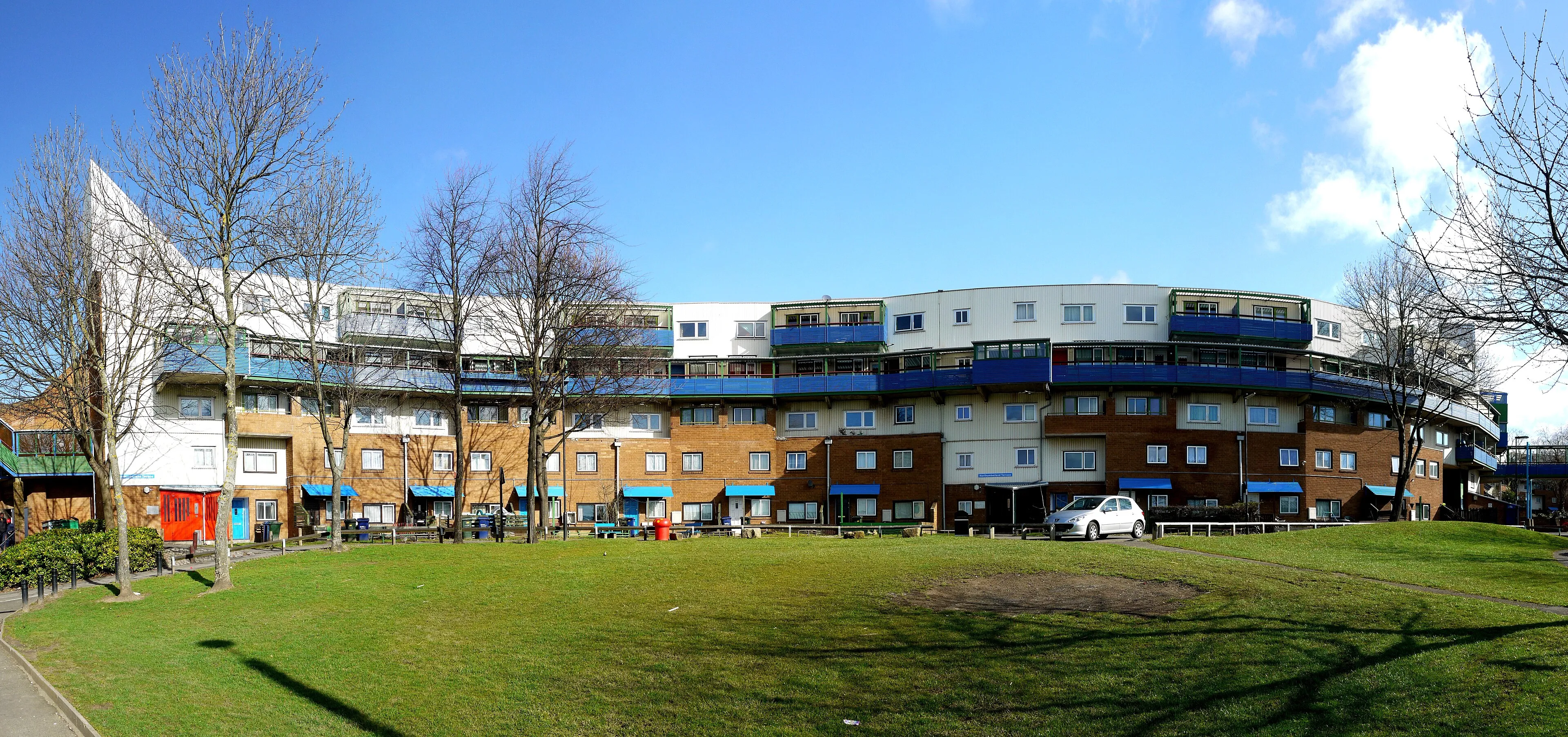 Byker Wall’s curving block of flats with brick lower floors, white upper levels and blue balconies, seen across a grassy open space under a blue sky. By Andrew Curtis, CC BY-SA 2.0, https://commons.wikimedia.org/w/index.php?curid=14566783
Be where your users are
Ralph Erskine set up shop in an old funeral parlour in the heart of the Byker estate. It had an open door policy. Residents were welcomed in to share ideas, concerns and worries, and sometimes they even brought domestic issues. To me that says a lot about the trust the designers built with the community.
Design for what is coming
As a direct result of this engagement, houses were pre-allocated so residents could plan their new homes and build anticipation.
The architects also famously anticipated the Central Motorway being extended through Byker. They designed ‘The Wall’ to shield residents from a road that didn’t exist yet, in case of future development.
Ask who it’s for before you fix it
Byker’s community-focused rebuild is one I think of often in my day to day as a UX and Product Designer. I’m not designing bricks and mortar like Erskine and co were, but a lot of the same principles can be copied no matter the design vertical you find yourself in.
It all starts with the user, the resident, the visitor, the customer, whatever they’re called: it’s them.
Keeping certain pubs, corner shops and bath houses? In UX terms, we’d call that protecting familiar patterns. Opening up a local office for direct feedback sounds a lot like feedback sessions, surveys, even analytics to some extent. Building a mile-and-a-half-long acoustic wall for a motorway that might or might not get built? Edge case, in the same way we design for users who end up spam-clicking a button 1000 times.
It was easy for those university students to look at Byker Wall and say “this is dated, therefore it’s bad”, in the same way I can look at a site or product and cringe at the use of Comic Sans or dated flows. But without knowing and respecting the history and expectations of the residents (users), you’ll never actually design something useful.
Erskine’s team didn’t turn up with a finished plan. They listened first, and what residents asked for is still there to see. UX and product designers have a lot to learn from other design disciplines. Architects have been wrestling with this for decades (co-creation didn’t start with a sticky note). Next time something looks awful to me, I’ll ask who it was built for before I ask how to fix it. What’s the last thing you wrote off before asking?
References
- Ralph Erskine’s vernacular plan, Natasha Vall
- https://udcsa.gsd.harvard.edu/projects/2
- https://municipaldreams.substack.com/p/the-byker-estate-newcastle-groundbreaking
- https://www.architectsjournal.co.uk/practice/culture/byker-ralph-and-me-bdps-tony-mcguirk-on-ralph-erskines-byker-wall
- https://urbandesignworks.co.uk/blog/the-byker-wall-a-modernist-success-story/
- https://www.theguardian.com/cities/2015/may/21/byker-wall-newcastles-noble-failure-of-an-estate-a-history-of-cities-in-50-buildings-day-41
Cover photo: By Unknown author - http://digitaltmuseum.se/011015013685/?query=Ralph Erskine&pos=203&count=242, CC BY 3.0, https://commons.wikimedia.org/w/index.php?curid=37958632